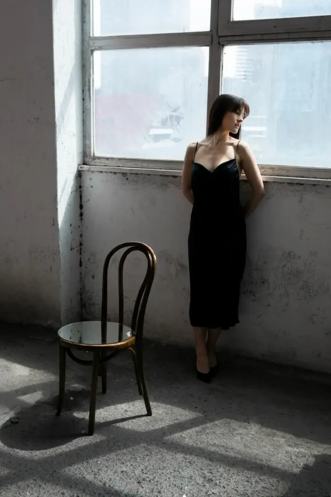
Quiet Light, Profound Elegance

Step into a world where restraint becomes luxury and understatement feels luminous. Today, we explore lighting design strategies for discreetly elegant rooms, revealing how layered illumination, refined optics, and thoughtful control shape spaces that calm the senses, flatter materials, and welcome conversation without demanding attention. Expect practical tips, real stories, and subtle techniques that make rooms glow gently, photograph beautifully, and live comfortably from sunrise to twilight.

Foundations of Subtle Illumination

Discreet elegance begins with intention. Before choosing fixtures, define how the room should feel at different hours and for different rituals, then build a layered hierarchy that places comfort and clarity above spectacle. Combining ambient, task, and accent light with careful dimming creates a visual landscape where nothing glares, everything belongs, and the eye travels softly from surface to surface without fatigue or distraction.

Architectural Integration That Disappears

Elegance grows when fixtures recede and the architecture takes the spotlight. Plan recesses early, coordinate shadow gaps with millwork, and ensure ceiling details anticipate trimless apertures. Conceal wiring runs, specify small-profile housings, and align everything with doorways and sightlines. The goal is simple: you notice the room’s serenity, not the hardware, while maintenance access and safety remain quietly, expertly resolved.

Warmth for Intimacy, Neutral for Clarity

Select 2700K for evening intimacy where candles or fireplaces might also glow, and consider 3000K where artwork or reading benefits from a touch more clarity. Use the warmest points at eye level while keeping ceiling ambient slightly cooler for depth. This gentle temperature gradient emulates natural light’s rhythm, preserving comfort without sacrificing detail or emotional warmth.

High CRI Without Harshness

Aim for CRI 95+ with strong deep-red rendering to honor wood grains, textiles, and skin. However, combine this fidelity with careful shielding and dimming so clarity never turns clinical. The trick is pairing excellent color science with optics that avoid glare, resulting in a room where everything appears accurate yet soothing, like a well-restored photograph printed on fine, matte paper.

Scenes for Everyday Rituals

Program scenes that match life: soft ambient for early coffee, crisp task for focused work, and hushed accent for late conversations. Store them with clear labels and gentle fade times to avoid harsh jumps. Scenes are less about gadgets and more about supporting rhythm, hospitality, and comfort through prompt, reliable changes that feel like the room is quietly listening.

Dimming Curves and Perceived Brightness

Human vision is logarithmic, so linear dimming often feels abrupt. Choose dimming curves that taper elegantly at the low end, preserving detail around 3–10 percent where ambiance lives. Combine high-bit-depth drivers with stable control protocols for smooth transitions. The result is cinematic, not theatrical—light that breathes rather than blinks, always matching mood without calling attention to itself.

Glare Management and Contrast

Elegance collapses when glare intrudes. Favor recessed optics, deep shielding, and thoughtful beam control to keep brightness within the comfortable range of the eye. Accentuate form with soft contrast, never hard edges that fatigue vision. When luminance is curated, shadows feel velvety, details emerge with poise, and the room’s quiet narrative invites lingering conversation.
Deep regress trims and black baffles conceal the source, reducing perceived brightness and preventing sparkle that distracts from conversation. Combine with precise aiming to avoid direct sightlines into lamps. This restraint encourages social ease and flattering faces, allowing crystal glass, brushed metals, and artwork to shimmer subtly while the ceiling remains comfortably, elegantly understated.
Choose narrow beams for distant accents, wider beams for general comfort, and use cutoff angles that prevent light entering the eye at uncomfortable positions. Snoots, honeycombs, and lenses refine spill, keeping brightness exactly where it serves. The result is depth without harshness, allowing architectural features to feel sculpted rather than spotlighted, like moonlight guided by modern craft.

Materials, Fixtures, and Finishes

The most refined rooms partner quiet fixtures with characterful materials. Choose trimless, minimal forms that recede, then let wood, plaster, and textiles take center stage. Favor reliable drivers, tight binning, and robust thermal management. Portable lamps, carefully placed, add intimacy and flexibility. The interplay of permanence and adjustability becomes the secret to consistently graceful evenings.

Finish Choices That Vanish

Match fixture finishes to ceilings and walls so hardware blends away. Use soft whites or deep charcoals, avoiding mid-tones that call attention. When a decorative piece must be seen, keep its scale restrained and its output dimmable. The room should read as coherent composition, with light as a material—felt, not announced—draped across textures like a fine, breathable fabric.

Quality Drivers and Thermal Design

Longevity and quiet performance depend on drivers and heat management. Specify reputable components with solid warranties, ensure ventilation in concealed cavities, and avoid hot spots that shorten LED life. When electronics are stable, dimming stays smooth and color stays true, preserving the effortless character of the room long after the first perfect evening and the hundredth gathering.

Sculpting with Portable Lamps

Table and floor lamps add human-scale glow exactly where conversation happens. Keep shades opaque enough to block glare while letting warm light spill downward. Use warm-dim or low-output sources for intimacy, and place cords thoughtfully. These movable notes bring hospitality to corners, refresh layouts seasonally, and offer guests the simple pleasure of adjusting light to suit their moment.

Stories, Testing, and Iteration

Refinement grows through listening and adjustment. Mock up options, live with them for a week, and collect feedback from everyone who uses the room. Photography tests reveal hotspots and dead zones the eye forgives. Small shifts in aiming, dimming, or color unlock surprising harmony, turning good decisions into quietly unforgettable experiences that feel personal and enduring.

Mockups That Save Regret

Before committing, tape temporary LED strips inside a cove, try different profiles, and compare dimming ranges at night. Photograph from doorways and seats to judge comfort. These low-cost experiments reveal proportion, glare, and finish interactions, preventing expensive corrections later while deepening your intuition for how light truly behaves in lived-in rooms.

A Client’s Library Transformed

One library felt stern until we added warm-dim picture lights, a hidden shelf graze, and black-baffled downlights aimed just off-axis. Books glowed, leather softened, and the ceiling vanished. Our client said conversations ran longer, voices relaxed, and late-night reading felt kinder. Elegance arrived not with brightness, but with care, patience, and silence between notes.

Invite Feedback and Evolve

Ask residents what feels too bright after an hour, which corners feel lonely at dusk, and where eyes strain during reading. Use their words to refine scenes and aiming. Encourage comments in our community, share photos of your trials, and subscribe to follow future refinements. Together, we shape rooms that feel like gentle company every day.

Vuzekikunipe
Privacy Overview

This website uses cookies so that we can provide you with the best user experience possible. Cookie information is stored in your browser and performs functions such as recognising you when you return to our website and helping our team to understand which sections of the website you find most interesting and useful.